Light Rail
Interface

Introducing a hybrid interface, seamlessly adapting to your needs with one-layer simplicity and intuitive operation.
Setup
Design Area
Tasks
Tools
Case Study
2022
Experience Design
Interface Design
User Research, Concept, Developement, UI Developement, Visualisation
Figma, Miro, Rhinoceros 3D, Keyshot, After Effects

Project Objective

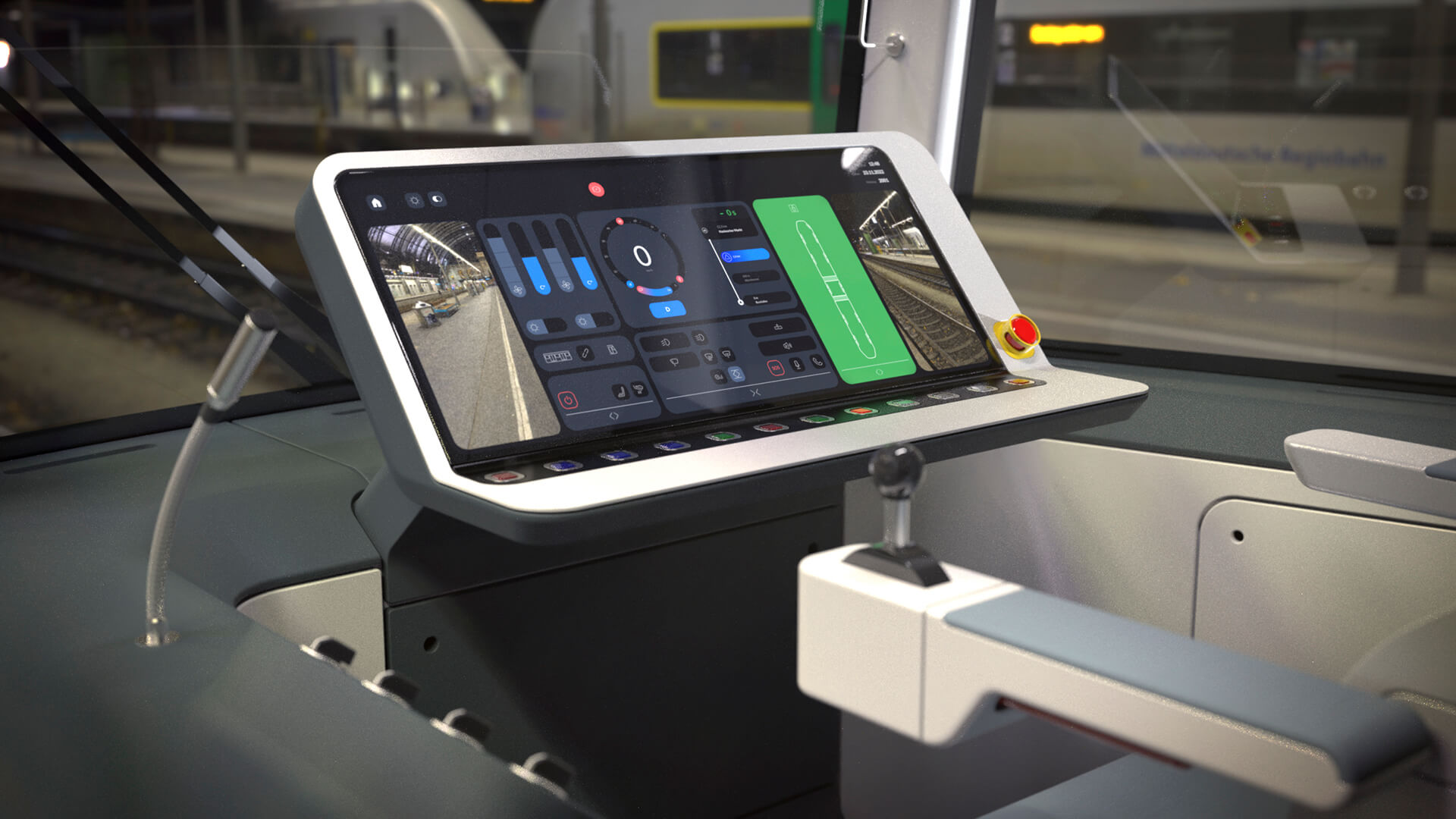
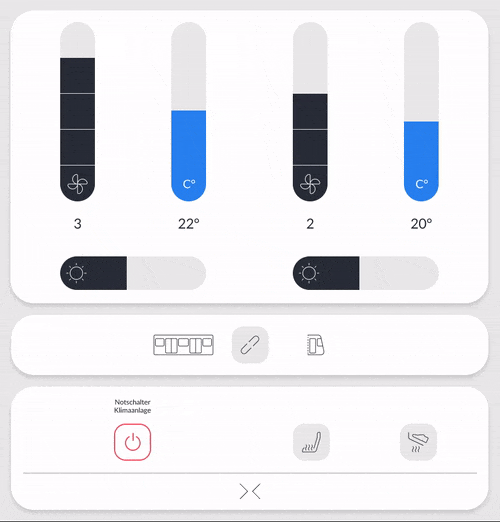
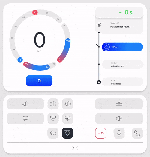
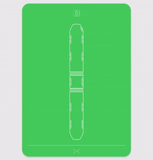
Our challenge is to create a user-friendly interface for light rail vehicles that is tailored to the operators' needs and optimizes the benefits of both digital and analog interfaces. The goal is to efficiently distribute high information density through an adaptive screen that adjusts information according to the situation, resulting in an intuitive interaction for the operators.

This case study is an extension of my previous work at büro + staubach, where I have been actively involved in improving the experience of public transportation users and operators.

The Solution - A Hybrid Interface


By leveraging the qualities of a large touchscreen as an input and information surface, the system is able to be highly responsive and adapt to the specific requirements of the users.

It allows for a seamless login process, providing users with only the necessary information for their specific role.
The screen layout automatically adjusts for every situation of the tour. To optimize passenger control during stops, the interface dynamically adjusts certain elements to ensure smooth in and egress.
Additionally, frequently used interactions come in the form of buttons, allowing for tactile feedback and quick interaction, making the overall experience more intuitive and efficient.
A rendered view of the cockpit and digital interface, displaying the dashboard in dark mode.

Design Research

The research began by exploring the intersections between interface and user group demands through workshops, journey visualizations, and mapping processes. The following research methods listed below led to four key questions:
Who interacts with the interface?
How can we leverage the versatility of a digital interface - and what are its limitations?
What are preexisting quidelines and functionalities that have to be implemented?
How can we reduce stress and cognitive load?

Stakeholder Map

This stakeholdermap visualize tasks and interdependencies for every user group.
For example: It shows that the cleaning personnel shares functionalities with the driver/operator, but does not need full access to fulfill their job. The UI should recognize the user and tailor the functionalities according to their needs.
A stakeholdermap displaying every usergroup with their respective task

User Journey: Operator

This user journey visualizes: emerging painpoints are high cognitive workload and high task density during key sections of the journey.
A user Journey for the operator with 4 main steps: Startup, Drive, Stop and Door Malfunction. This journey shows every task for the operator and visualizes the cognitive load

Cluster & Allocate Functionality Groups

We developed this functionality cluster in a workshop with light rail operators.  By separating groups based on function, buttons and menus can be arranged logically. It enhances usability and understandability and reduces user error.
A Clustermap of all the functions of a light rail vehicle

Visual & Ergonomic Analysis

The layout of UI was optimized to fit human visual field and reach, displaying important information at the top of the screen, color-coding interactive elements for better peripheral recognition, and placing them within easy reach of the operator.
operators' field of reach
60° field of view: 
only colors are recognizable
40° field of view: 
symbols are best recognizable
20° field of view: 
text is best recognizable
field of view combined with operator's reach
result in optimal interface layout

Design Principles

Using the insights we gleaned from our research, four key design principles where developed:
Seamless
Identification and Login is a short and intuitive process that leads to a user-taylored UI.
Adaptive
The Interface utilizes route informations to adapt the UI-Size and functionality to key requirements of the tour.
Tactile
Besides a rich digital UI, analogue buttons are used for main and repetitive tasks. Outside of the operators field of view the tactile texture allow for quick and intuitive interactions.
Supportive
The UI supports the operator when technical, navigational issues occur. The systems guides through possible troubleshooting and eases the communication with passengers and control center.

Concept Developement

The UI is structured into 3 main functional groups that adjust according to the situation, also allowing to hide irrelevant functionalities for other user groups.
Site map:
Operator
Site map:
Cleaning Personel
The main UI uses a single layer layout. The operator's "time on screen" was reduced by avoiding submenus. The following prototype visualizes how the 3 main functional groups adapt their screen sizes to the situation. This provides relevant informations and eases touch interaction by providing more screen space.

Wireframes

This early rough wireframe allowed for placing interactive elements and test interactions as well as user behaviour.

Virtual Prototypes & Mockups

Testing screen size transitions for the drive module including the visual change for the tachometer.Testing screen size transitions for the climate module.A gif that shows how the greenlight works in fullscreen
Testing screen size transitions for the drive module including the visual change for the tachometer.
Testing screen size transitions for the climate module.
The "Greenlight" is clearly displayed in the background, indicating that all doors are closed and lock.
A daylight and dark mode for the UI was developed. It is linked to light sensors inside the cabin and switches automatically between the two modes.
Main functions such as the horn, e-brake, indicators and door operation are operated with physical buttons. They can be placed independently from the Screens and allow for better flexibility and ergonomic optimization.
A ledge below the screen allows the operator to rest his palm while using the interface, reducing the risk of a "gorilla arm" and increasing the precision of his interactions.